Other Projects
Class Projects that either were not done in a graphic design medium, or had outside involvement.

Still Life Project
This still life drawing was the first project I completed in my first design class: Communication Design. The project itself was to set up a still life and illustrate it traditionally using colored pencils as the medium. The goal of this project was not only to present a completed still life illustration, but it also served as a steppingstone for the first official design project I completed, which would include using colored pencils to draw an illustration that would be implemented into the finished product.
The still life itself was a small accumulation of plush toys and a few other small objects that happened to be laying around my dorm room at the time. The composition was set up on a stool that was against my desk, and I rigged up a light off to the side to be able to get the more visible shadows seen in the final product. I chose to focus on objects that had more organic shapes, or smaller details give myself more of a challenge, which included the clear plastic edges on the bracelet near the center of the piece, and the harsh and soft shadows seen on some of the plush toys.
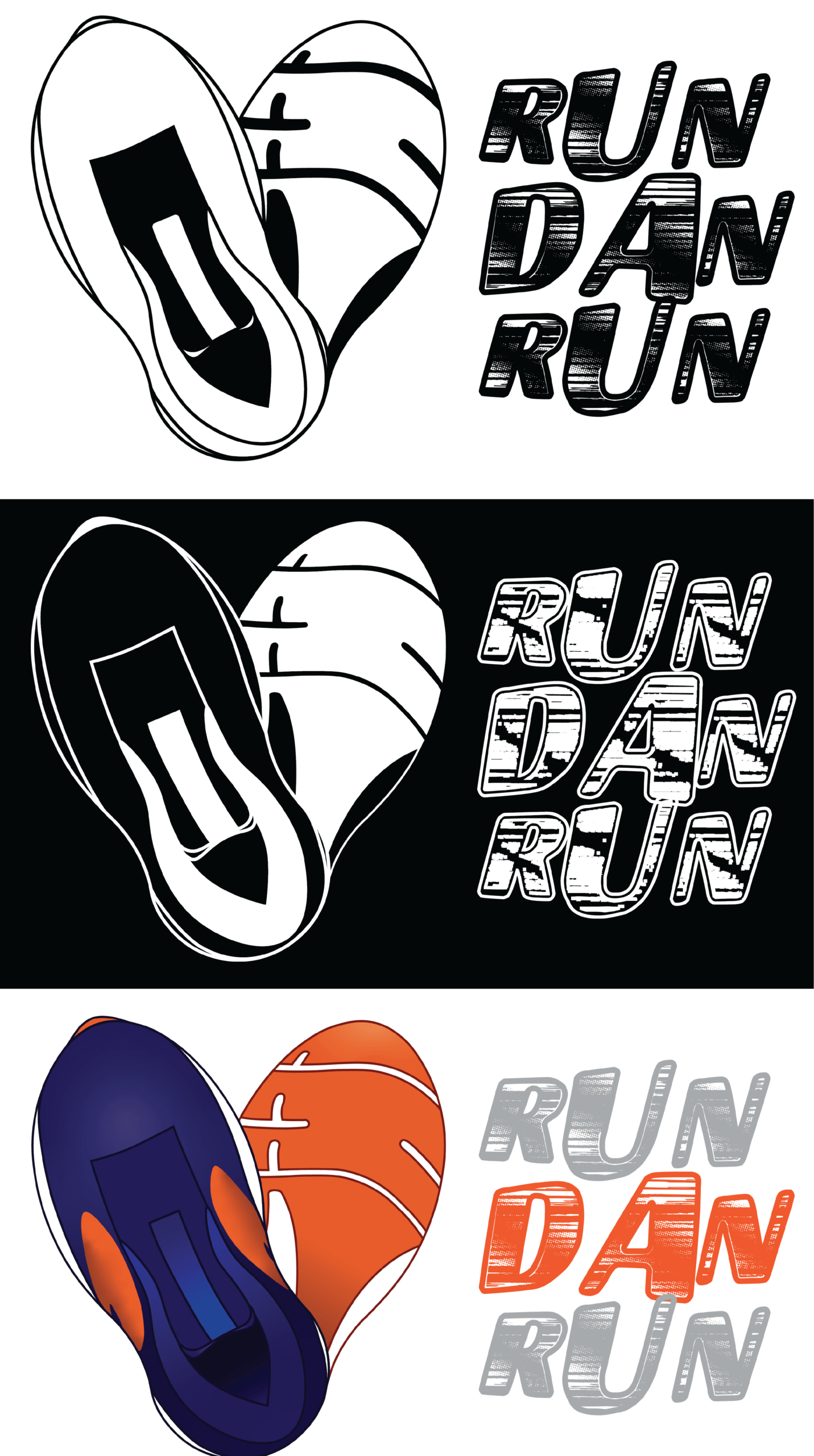
RunDanRun: Custom Emotes
This project initially started as part of the Logo Project for my Digital Design and Presentation class, the same one that led to the making of the Granny’s Candies logo. For the second logo design, I worked with RunDanRun to come up with a potential logo for his streaming content. At the time, RunDanRun was in the middle of a content rebrand, and had asked for my help in designing some new graphics for his twitch channel. The end result for that project was a heart made up of two shoes, one viewed from the top down and the other viewed from the bottom up. The design of the shoes was modeled after the actual run shoes RunDanRun wears on his running streams. The reason the shoes are placed in the shape of a heart was to pay ohmage to an icon RunDanRun had in the past, which was a beer mug on an angle to create a heart; though that design was being retired in a way when RunDanRun chose to shift his content to focus more on running.
The colored variation of this logo was later turned into a custom emote RunDanRun uses on his Twitch streams.
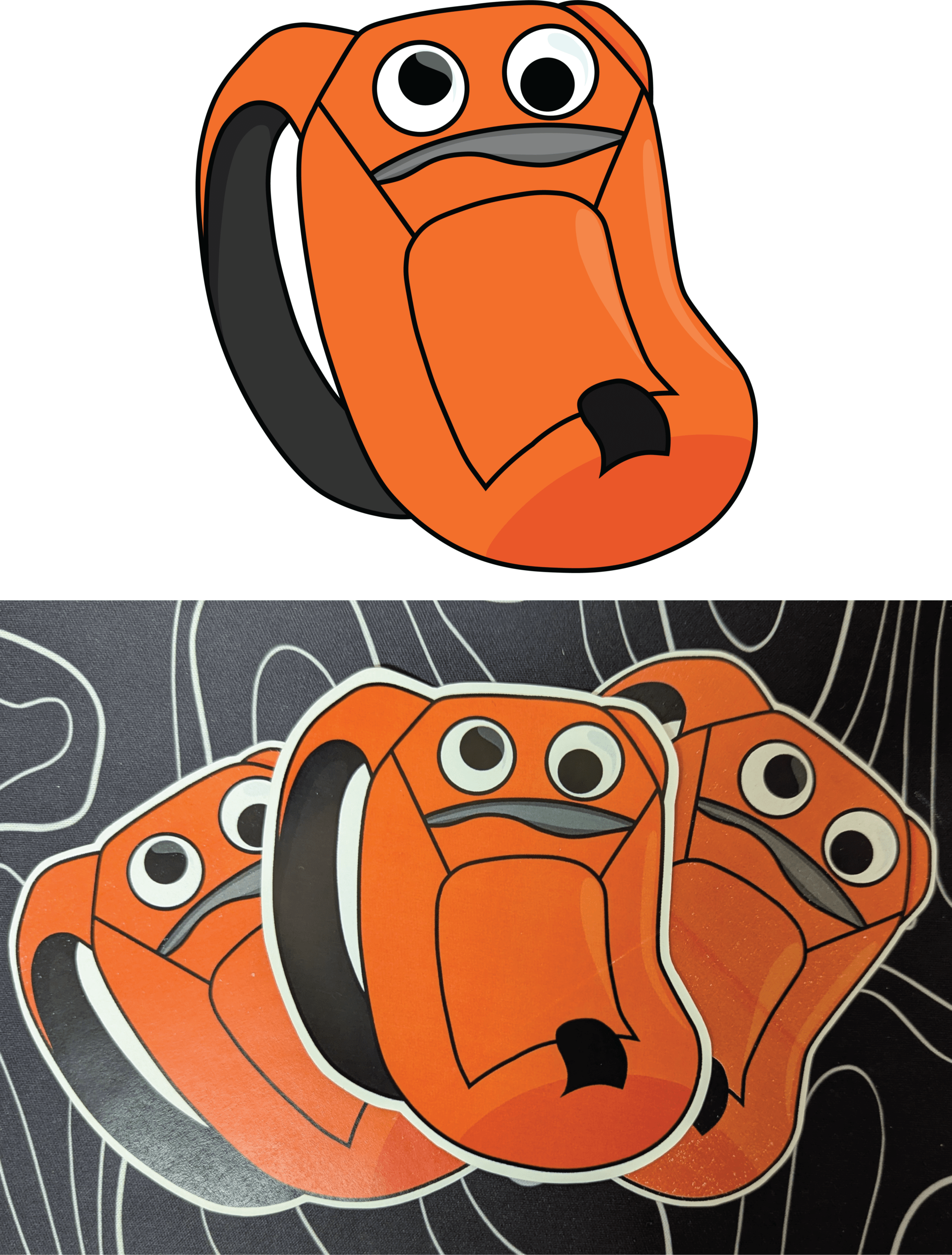
RunDanRun: Custom Stickers
This project was actually initially part of a larger packaging project for my Digital Design and Presentation class. However, I chose to highlight this single part of this project because it turned out the best once made into a physical piece. The original premise for the packaging project was to design at least three packaging components for one of the two companies I had previously designed logos for, and I chose to work with RunDanRun once more.
The part of the project shown is a sticker design I came up with that could hypothetically go in with the packaged merchandise orders being sent out. The design was based on the backpack RunDanRun uses during his running livestreams, which he has cleverly placed googly eyes on the top to make the top pocket of the bag appear as a mouth, thus giving the illusion that the backpack has a goofy looking face on it.

Woodblock Print: Original Character
This print was made as the final project for my Beginning Woodcut class. The print itself is an illustration that I created in inspiration by one of my favorite shows, which centers around Chinese mythology. The scene based after Tuolong, a figure in Chinese mythology that was sealed away in an underwater cave for his misdeeds. I stylized the print’s design after the show’s artstyle, using background images of underwater scenery from the show itself to come up with the background, as well as the rock the figure is standing on.
The piece started out as an illustration I drew digitally, then flipped the image and transferred it onto a 12-inch by 18-inch plank of wood by using a projector to be able to trace the design onto the wood block. The design was carved onto the wood block, with the majority of the carved design being the lines so that the carved details would pop against the inked areas. When it came to printing, I chose to do a rainbow roll of black and dark blue ink to create a high contrast against the white paper. There was a total of 24 prints made total, though about half of them were turned in for the final project.